Why Power Per Square Foot?
Over the past two decades, we’ve watched technology transform customer behavior as whole industries have been disrupted: big box stores and online retailers have become a reality in today’s competitive landscape, the customer’s path to purchase has evolved well beyond the all-in-one exploratory and decision in-store visit, and customers’ expectations have morphed into a demand for quality and value when it comes to both product and experience.
When it comes to retailing, it’s evident that customers no longer enter the store with a sole focus on getting information. Typically, they’ve done their research and are now ready to shop—not just for products (they’ve already done that online), but for added value. More specifically, they’re looking for an experience that makes it worth their while to shop at your store.
- Over 50% of shoppers say they would pay a higher price for the customer experiences they value most, and 77% of shoppers would be more loyal to stores that provide their personal top three customer experiences (Synchrony Financial).
- Businesses can lose 20% of revenue from poor customer experiences (Oracle).
- 95% of consumers share bad experiences with others (Zendesk).
This research shows that retail is more about selling an entire experience that’s personalized and purposeful than about selling a product. According to the National Retail Federation, “the challenge for a retailer today is to rise above a line item on a to-do list; it’s to provide a solution to shoppers’ needs—in a way that gets the shopper to emotionally slow his pace and breathe.” In short, the latest trend is about making the store environment and the selling approach more emotionally engaged and less product-centric.
Clearly, today’s key to spa retailing success is making the customer experience your competitive advantage. Here’s how you can make it happen.
Store Ambience
Exterior Signage & Appearance
Getting someone to walk through your doors is arguably the biggest challenge at the beginning of the customer relationship. 52% of consumers have avoided a business altogether because it looked dirty from the outside and 95% say that exterior appearance is important in their selection of a place to shop. Your outside signage and general exterior appearance work as a first impression that leads people to want to see what’s inside your store.
Outdoor signage can take the form of entrance signs, sidewalk signs, or window signs. When deciding where to place signage, you want to prioritize visibility for both walking and driving passersby. All signs should be branded and designed to reflect what kind of experience customers can expect once inside your showroom.
Atmosphere
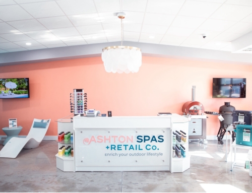
Because they play into buyer emotions, the atmospherics of your buying environment effectively work to enhance purchase probability. Most importantly, comfort is key to establishing trust. So it’s important to maintain an open and inviting space. Plan your color palette using subtle earth tones and soothing cool tones for most walls to stimulate an emotional response. White, black, and metallic accents suggest luxury. Wearing branded clothing with these accent colors on your sales floor is one way to do just that. See Bullfrog Spas Apparel options on pages 20-29 of your POP catalog.
Lighting is an absolutely critical component of a buying atmosphere. Lights should be natural and even. Daylight-colored lighting will show the product colors as they will appear in the outdoor environment where they will be used. Additionally, you should use spotlights strategically to illuminate key products and in-store branding.
You want your store to smell pleasant, like a day spa, never like a swimming pool. Music should be soothing and calm. And plants can be used to soften the overall ambiance of your overall showroom.
Store Layout
Entrance & Decompression Area
Research shows that retailers benefit from having a “decompression zone” at the store entrance that is open, inviting, and easy to navigate where customers can process transition. Give your customers a few moments to adjust to their surroundings before they can be ready to take in new information. The suggested size is 50-150 square feet of open space with very minimal, tasteful decor and no signage. A Bullfrog Spas Showroom Mat (Part #35-2935, pg 10 POP catalog) offers a perfect welcome where customers can “land” after walking through your doors.
Traffic Flow & Product Layout
Retailers typically apply one of three layouts: the grid, the free flow, or the loop. Given the size, shape, and function of spas, the loop is suggested for spa retailers. Because 90% of North Americans prefer to turn right when they enter a store, a counter-clockwise flow works to keep traffic moving in a comfortable, uniform direction throughout the entire store while giving the option for the customer to stop at each spa.
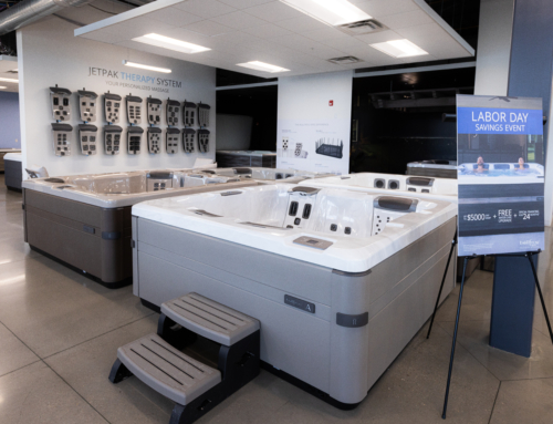
How you layout your display spas can create visual interest and strategically slow traffic flow. Of course, the longer customers linger, the better potential there is for engagement. Squared-up spas all facing the same direction create straight lines that encourage customers to shop fast, often skipping products as they go. Instead, arrange your display spas with space to walk completely around them. This configuration also provides space for demonstrations and allows customers to explore products with their hands. Suggested spacing around spas is 24 inches minimum.
It’s no secret that customers love being able to see products from all angles. Displaying spas on end or using the Bullfrog Spas Spa Display Stand (Part #45-2010, pg 18 POP catalog), which shows the spa at 45 degrees, adds creativity to your display, saves floor space, all while satisfying your customer’s curiosity to see spas from different angles.
Purchase Consultation Area
When it comes time to discuss transaction details, it helps to have a dedicated area set apart from store traffic. A comfortable, quiet meeting space allows you to discuss purchase details and negotiate without the added pressure of a dreaded back office. Suggested decor for this area includes tasteful patio furnishings (doubling as a display) arranged for a pleasant, casual discussion. The suggested space is 150-300 square feet.
Checkout
To make the most of each transaction, your checkout area should be placed at the end of the natural traffic flow pattern since it’s the prime location to capture recurring sales and small impulse items. Keep your checkout area clean and uncluttered while dedicating 2-3 square feet of counter space for your impulse products.
Merchandising
Spa Models and Colors
One of the obvious benefits of a brick-and-mortar showroom is the opportunity for customers to see, feel, and experience products first-hand. It’s important to show the spas you intend to sell; however, it’s even more critical to be strategic about the model, color, and options choices in order to create the greatest sense of value for the customer. You’ll want to start with your Premium models and display product in color combinations that visually impress. Many times these are solid colors like white, silver, and smooth marbles.
Match display spas to the aesthetics of your showroom and make use of tools like color selector boards. Check out Bullfrog Spas’ Interior/Exterior Swatch Boards (Part #35-3930, pg 35 POP catalog) and the Design Studio Complete Kit (Part #35-00506, pg 15 POP catalog) to assist customers in ordering any colors you don’t display. You can also use Bullfrog Spas Spa-side JetPak Displays (Part #35-1330, pg 16 POP catalog) to highlight specific JetPaks customers can choose from.
Test Spas
Like all product trial experiences, test spas help move a sale forward without pressure. Give thought to location, privacy, accessibility, dressing room, ambiance, and even the quality of linens/towels when designing a test spa space. Offer spa testing after hours or by appointment for those who would like added privacy. Suggested 200-400 square feet.
Recurring Purchase Items
Though it may be a while before your customers purchase another spa, there are plenty of products needed to maintain a spa that can help establish repeat visits and longer-term sales. It’s best to direct these returning customers towards the back of the store for larger repeat purchases, including filters, cleaning supplies, and chemicals. With smaller impulse purchases like spa scents and candles, it’s better to use space next to or within the checkout area. Depending on your product mix, it is suggested that you dedicate 20-100 linear feet of shelf space or the equivalent square footage in free-standing fixtures for recurring purchase products.
Point of Purchase Materials
Branding
Branded displays create a sense of purpose and professionalism while reinforcing that you truly believe in your selected product lines. In turn, these pieces work to increase the customer’s sense of trust and comfort. Ideal displays for your walls include Bullfrog Spas 3D Wall Mount Logo (Part #35-3560, pg 10 POP catalog) and Poster Set (English Part #35-1184, French Part #35-2050, pg 9 POP catalog) that provides branded imagery and a sales aid wrapped into one.
Add freestanding displays to bring branding with benefits info to the customers right on the showroom floor. Check out Bullfrog Spas Feature Benefits Floor Stand (Part #35-4000), Engineering Banner Stand (Part #35-2215), and Performance Floor Stand (Part #35-3535) on pg 11 of the POP catalog.
Large Scale Lifestyle Graphics
Large-scale lifestyle pieces sell the dream of hot tub ownership, illustrate the benefits, and illustrate the overall brand message. These pieces should be large, professional photographs that create strong emotions through thoughtful subject matter and placement. Subjects should include backyard landscapes, family time, contemplation, escape, stress relief, and relaxation. Dimensional fabric graphics or large vinyl wall clings like Bullfrog Spas SEG Graphics and Standard and Customized Wall Wraps (pg 12-13 POP catalog) are professional and impactful.
Price & Product Spec Signs
Clearly, visible pricing creates trust and gives you and the customer an anchor and clear starting place for negotiating. So it’s critical that you never make your customers guess about the basics. You should have a sign highlighting key product specs as well as price next to every spa on display (see Bullfrog Spas Aluminum Spa-side Signs and Spa-side Sign Holders, pg 16-17 POP catalog).
Interactive Experiences
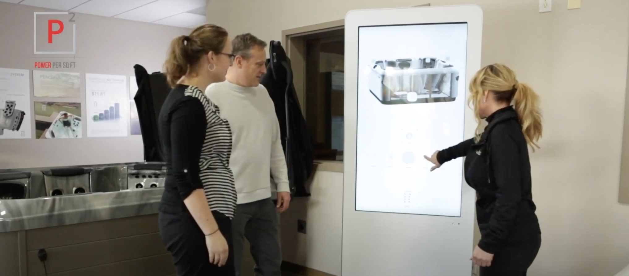
Retailers today are finding that customer experience is just as important as product selection and price on the showroom floor. Interactive technology experiences impress Gen Xers and Baby Boomers with the technology while they sell. Digitally native Millennials just expect it. Engaged consumers buy 90% more frequently, spend 60% more per transaction, and are five times more likely to indicate the tech-enabled brand is the only brand they would purchase in the future.
As mentioned above, the interactive Bullfrog Spas Design Studio Complete Kit (Part #35-00506, pg 15 POP catalog) helps customers make color choices in a fun, visual way. The Design Studio allows you to display all color options available while merchandising your store strategically with products that look the best and create the right ambiance.
Bullfrog Spas is your spa manufacturing partner committed to helping dealer partners reach your investment goals. With this comprehensive Power Per Square Foot approach, your dealership is sure to provide something the competition does not: a strong value proposition, an engaging sales process, and a showroom experience that absolutely delights.


Leave A Comment