Is your showroom set up to make selling easy? Veteran hot tub retailers may think you have this aspect of your business down, but are you sure? Is there retail science backing your showroom design and merchandising plan?
Or the real question: Is your showroom design creating the most possible value for your business?
As competition for discretionary dollars has risen over the years, understanding consumers’ shopping habits has become increasingly critical. And though it’s true that most consumers perform extensive internet research beforehand, Canada’s Better Your Business project reports that “up to 75% of product purchasing decisions are made in the store … Of those, all are made within the last three feet.” When it comes to business performance, the layout, look, and feel of a retail space actually does come down to a science.
Just ask Paco Underhill, founder and managing director of Envirosell Inc., who advises companies on how small changes in retail environments can add up to increased sales. Underhill has made a career out of researching the interaction between customers and their environment. And based on these findings, many of his recommendations are now considered rule-of-thumb by the retail industry. But how do they apply to the spa retailer?
Retailers' common goal is to effectively present product in a way that emotionally engages the customer while optimizing traffic flow.
From a scientific perspective, spa retail is no different than other types of retail. Despite the variations in size and shape of retail space, all retailers’ common goal is to effectively present product in a way that emotionally engages the customer while optimizing traffic flow. In this article, find out how your merchandising design strategy can ensure you are making the most out of your selling space.
Basic Layout Principles
Your retail presentation begins in the parking lot but gets critical once the front door is cracked. In a 2015 Harvard Business Review article, Magids, Zorfus, and Leemon document that the more emotionally involved a customer becomes in a retail space, the higher the chance that they buy. And Underhill found that how a retail space is configured can influence customers’ sense of comfort during the shopping process. So it’s important for spa dealers to keep their retail space open and inviting. Any low ceilings or confined spaces should be avoided. Underhill points out that more maneuvering room extends time customers spend in the store, improving the probability of purchase.
Store Entrance
Research has found that retailers benefit from having a “decompression zone” at the store entrance that is open, inviting, and easy to navigate where customers can process transition. It’s been proven that customers need a few moments to adjust to their surroundings before they are ready to take in new information. Kizer and Bender explain that, since they’re in a transition mode, customers are more likely to miss any product or signage you place there. So for most spa retailers, the first 5 to 15 feet worth of space (depending on store size) would be an ideal “landing strip” for the shopper to simply get a sense of what they’re looking for and how to go about finding it.
Shopping Traffic Path
When it comes to store design, retailers typically apply one of three layouts: the grid where fixtures run parallel to the walls (think grocery store aisles), the free flow which has no set aisles or straight lines (i.e., your quintessential boutique store), or the loop that offers a clearly defined main aisle which circles through the store.
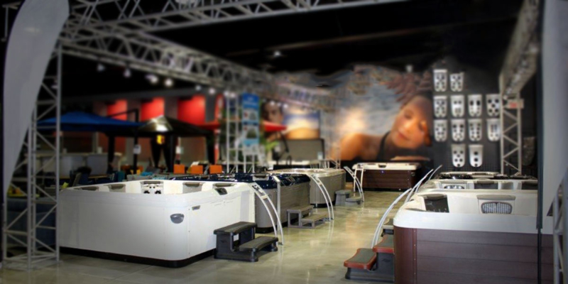
Given the form and function of the hot tub product, the loop generally works best for spa retailers. It keeps traffic moving in one uniform direction throughout the entire store, but gives the customer the option of stopping at each hot tub and walking completely around it.
The next step is to decide which direction this loop should go, clockwise or counter-clockwise? According to Underhill as well as the Association of Consumer Research, 90% of Americans generally want to turn right when they enter a store. Whether this has to do with the fact that most people are right-handed or that Americans are programmed to stay right because of the side of the road they drive on has yet to be scientifically determined. But it doesn’t change the fact that loops are most effective when they direct the customer to turn right upon entering the store.
Product Placement
Chevroning, or positioning display shelves or racks at an angle rather than at the traditional 90-degree angle to the aisle, is another concept Underhill introduced to maximize customers’ view of the merchandise. This principle also holds true for larger products that do not require shelving, including hot tubs. As a result of the units being turned at a 45-degree angle, more of the spa product is exposed as customers approach.
...the more customers see, the more they purchase.
The logic behind the recommendation is “the more customers see, the more they purchase.” Additionally, customers see the product from a more inviting and interesting angle. They won’t necessarily know why, but customers will report that they like a spa at an angle more than one presented head on.
Checkout
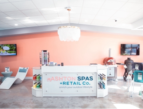
For smaller-priced, high-margin items, most retailers intuitively know to place impulse purchase opportunities near the checkout while directing repeat business towards the back of the store. But what comprises these two categories? Impulse purchases for spa retailers may include candles and packets of spa scents, things customers don’t usually think about. Repeat purchases would be chemicals and other maintenance products. By encouraging customers to walk through the whole store, you may be able to create interest in your latest and greatest products with those who have already demonstrated an appreciation for hot tubs, facilitating conversations about a new spa purchase.
Test Spas
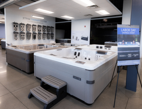
To draw customers in and present a more inviting space, it’s essential to make your products accessible. By placing stairs and spa rails on popular hot tub floor models, your customers can feel welcome to get in and try it out. Sitting inside the hot tub provides a better understanding of what it would feel like to be a hot tub owner given the more experiential perspective.
Spa retailers that can go one step further by offering actual product testing environments and appointments will have an even greater potential for augmenting customer emotional buy-in and driving in-store traffic. Like all product trial experiences, test spas help move a sale forward without pressure. Letting your hot tubs speak for themselves is a much more effective sales tactic, especially if you can get the whole family’s buy-in at the same time. Plus, when you’re one of the few spa dealers in an area that has a test spa, customers are more likely to choose your store first. If you’re one of the few who doesn’t have a test spa, you’re likely losing business to the competition.
Purchase Consultation Area
When it comes time to discussing transaction details, it helps to have a dedicated area set apart from store traffic. A comfortable, quiet meeting space allows you to make the agreement process conversational without the added pressure of a dreaded back office. This space is also ideal for displaying a credibility wall that speaks to brand identity with authorized dealer plaques, awards, BBB certificate, photos of local business-sponsored groups, and spa install photos. Dealers often tie their patio furniture offerings and backyard decor into this space, making it a casual setting that fosters openness and trust rather than intimidation.
Building Atmosphere
The atmospherics of your showroom really can make the difference between a showroom that shows and a showroom that sells.
Atmospherics were originally defined as the effort to design buying environments to produce specific emotional effects in the buyer that enhance his/her purchase probability. This idea referred to leveraging the psychological impacts of a person’s five primary senses on decision-making. Basically, retailers don’t need to change the product or advertising to see more sales. All they have to do is create an environment that entices customers.
There is a well-established body of research on the value of creating a comprehensive shopping experience through creative use of lighting, arranged displays, and space, and few have taken that to heart as well as Eric Mercier, sales manager for Piscene Hippocampe located in Delson, Quebec. The store underwent a massive remodeling two years ago, and since then he attributes about 25% of the store’s sales growth to innovative changes to the ambience.

Photo courtesy Piscine Hippocampe
The goal of an atmospheric shopping experience is immersion, he says. Comfortable customers who are immersed in their environment tend to forget that they’re out shopping and are more likely to stick around and browse. This keeps customers in the store longer and gives your sales reps more time to find the right solution.
Here are keys tools dealers can use to optimize atmospherics in the spa showroom:
Point of Purchase Displays
 With their power to elicit excitement and enthusiasm for a product, emotion-oriented POP displays can facilitate the sales process for your sales team, driving showroom conversions. Katelyn Gray from SmartSign argues that, by displaying persuasive signage that has a purpose and does not produce a sense of clutter, retailers “can create a higher perceived value for products.”
Furthermore, making the effort to place sold signs on spas around the showroom can subliminally communicate store success, producing a sense of buying urgency to new customers. If the overall goal of your showroom is to convert customers from mere prospects into revenue-generating purchasers, POP displays can be your secret weapon for success.
Music
The choice of music in your showroom can also influence customer perceptions of your business. Background music is a powerful tool to help customers relax and feel at home—as long as it’s handled right. Your musical choices must align with the goals of your business and the preferences of your market.
Typically, calm and soothing music helps customers relax and can even help them visualize how your spas will look in their own homes. Songs from our younger days tend to resonate best with our psychology; aim for tracks that were in vogue during your target market’s early to mid-20s. For most spa buyers, these songs will have been hits between the mid-‘70s and the mid-‘90s. Choosing relaxed tunes from these eras will trigger nostalgia in your markets and subconsciously relax them, making them more attuned to the products on display. Plus, it gives your staff something to groove to during business hours.
Lighting

Photo courtesy Piscine Hippocampe
A key addition to the Piscene Hippocampe showroom floor was the installation of spotlight lighting, Mercier says.
“When the lights shine on the spa, it looks majestic, like a paradise in the middle of the showroom,” he said. “It’s about making the product look special.” Doing so helps the customer tune out other visual cues and focus on just the product, he added.
The lighting of your showroom’s interior can greatly influence your customers’ state of mind. The goal is to find an ambient sweet spot between brightness and dimness—harsh, bright lights reflect off of typical spa product surfaces and create unattractive glares.
However, lighting that is too low will fail to illuminate your displayed products and can make craftsmanship hard to see. It’s also vital to clean each spa continuously to help it shine better in the light, Mercier adds. His salespeople consistently wipe their spas down several times during the day, often during downtime.
For the most appropriate mood lighting, think date night. Aim for soft, indirect light sources to illuminate the room while leveraging brighter track lighting for each specific display.
Colors
There is plenty of science to support the connection between color and emotion. Cool colors, such as blues and greens, are soothing. Warmer colors, such as oranges and reds, are stimulating. Metallic colors, along with black and white reflect luxury. Your market’s in-store experience will be greatly affected by your choice of showroom color scheme.
Prioritize neutral, earthy tones that don’t distract viewers from your product line. Earthy browns and greens help customers subconsciously internalize how your spas may look in natural environments, such as their own backyards. Take advantage of this by creating relaxing and natural color environments in your showroom.
Remember: Effective color design is just as much about what you avoid as what you choose. White, blank walls appear drab and give an unfriendly and sterile impression. Bright, clashing colors are distracting, unpleasant to look at, and can appear unprofessional. Prioritize soft, inviting colors that are easy on the eyes and comforting to your shoppers.
Scents
 Research has shown that olfactory stimuli have a tremendous impact on memory, mood, and consumer behavior—a bigger impact than any other of our senses, in fact. This is why so many realtors bake cookies in the homes they’re showing; positive scents lead to positive emotions. You can use the same strategy inside your spa showroom.
Sure, you probably don’t have an oven in the middle of your store, but warm, inviting fragrances like lavender, fresh linen, or spice can trigger powerful sense reflexes in your customers and get them in a positive mood before they even speak with a sales rep. And even if you don’t use specific fragrances, take care to get rid of any unpleasant odors that your showroom may have. Plastic-like odors reminiscent of hospitals, for example, simply won’t do a thing to reinforce positivity in the minds of your customers!
Plants
Including plant life in a spa showroom is an easy way to improve audience engagement and attentiveness to your product line.
According to data compiled by Psychology Today, including plant life in your otherwise barren showroom may have benefits that include:
- Increased customer attentiveness
- Improved perceptions of the showroom space
- Improved sensations of well-being overall
On top of that, plants and flowers smell fresh and complement the earthy color tones that your showroom should have. There’s really no drawback—add a few plants to your showroom to give it a fresh and lively feel.
Design Works
The bottom line is, the success of your spa enterprise relies on a carefully crafted mix of layout and ambience within the showroom. At the end of the day, retail design serves as a mechanism that “transforms information-seeking into purchasing activities” and a process that can “enhance or diminish the service encounter experience.” Inevitably, it has a great impact on your business’s bottom line. As Steve Jobs so insightfully put it, “Design is not just what it looks like and feels like. Design is how it works.” So let’s make showroom design work for your business.


Leave A Comment